Print magazine
Designing Business Cards: The Complete Guide for Businesses Looking to Make a Convincing First Impression
Published on 15 September 2026
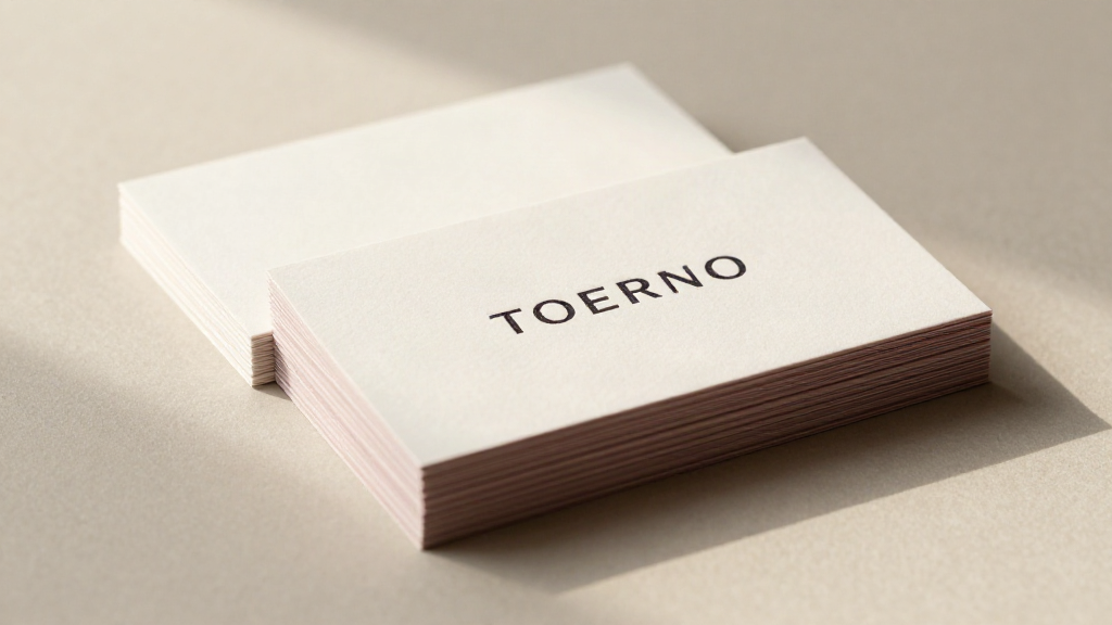
A business card is usually the first tangible piece of your company that a customer holds in their hands. It turns a brief conversation into a lasting impression and often outlives any digital contact. To make this exact moment a success, thoughtful design is well worth the effort. In this guide, we show Austrian businesses step by step how to design business cards that make a compelling first impression – from paper choice and layout to print-ready files.
Why a Business Card Is More Than Just a Carrier of Contact Details
In times of LinkedIn and QR codes, business cards are sometimes underestimated. Yet especially in face-to-face conversations – at trade fairs, client meetings, or networking events – they build trust. A high-quality card signals diligence, awareness of value, and a certain standard of excellence. It serves as a mini-ambassador for your brand that continues to work in a wallet, on a desk, or across a conference table.
Anyone designing business cards should therefore not focus solely on the content, but view the design as an integral part of their brand strategy. Every choice – paper, format, color, finishing – sends a clear message.
Step 1: Define the Target Audience and First Impression
Before you start designing, clarify whom your business card is meant to appeal to. A card for a young startup in the creative sector looks different from one for a traditional law firm or a restaurant on Lake Constance. Ask yourself:
- What image should my company convey – modern, classic, playful, or serious?
- Who receives the card, and in what context?
- How much information is truly necessary?
First impressions form in fractions of a second. A clear hierarchy, a deliberate reduction of colors, and easily readable typography appear far more professional than cluttered cards trying to say everything at once.
Step 2: Choose the Right Dimensions and Paper
The classic 85 × 55 mm format is standard in Austria and throughout most of Europe, fitting neatly into any wallet or cardholder. In addition, there are rounded corners, folded formats, or custom die-cut shapes – they stand out, but can be less practical to store.
Almost more important than the format is the paper. The grammage (paper weight) determines how sturdy and high-quality the card feels. Standard weights start at 300 g/m²; for a particularly premium tactile feel, 350 g/m² or more is recommended. Key factors also include:
- natural white or high-white paper for a clean, neutral look
- textured papers such as linen for an elegant, tactile surface
- black or dark cardstock for a visually striking contrast
Especially for short runs, premium materials are an ideal choice, as the price difference per card remains modest while the perceived quality increases dramatically.
Step 3: Align Colors and Typography with Your Brand
Your business card should seamlessly match your logo and overall brand identity. Reiterate your brand colors in defined areas rather than creating a colorful mix. Less is often more: a bold accent color paired with generous white space conveys confidence and reproduces reliably in print.
When it comes to typography, stick to a single primary font on the front, possibly paired with a complementary font for the back. Use legible sizes – especially for contact details – and ensure adequate margins. A bleed margin of at least 3 mm plus a safe zone from the trim edge prevents important content from being cut off.
Step 4: Structure Content with a Clear Hierarchy
The front typically features the logo, name, and job title, while the back carries the contact information. Arrange details in order of importance: name first, followed by role, phone number, email, and website. Be selective about which channels you include – fewer, well-formatted details look much more professional than an exhaustive list of every profile imaginable.
A QR code on the back can lead directly to your website, a booking page, or a digital profile. Make sure it is reproduced cleanly for print and has sufficient quiet zone around the pattern so it scans reliably.
Step 5: Finishes – The Polish That Elevates Perceived Quality
Finishes turn a good-looking card into something special. They make the difference between a card that gets set aside and one that sparks a conversation. Popular options include:
- foil stamping in gold, silver, or copper for a luxurious, gleaming detail
- hot foil or spot UV varnish on selected elements for contrast and depth
- blind embossing for a subtle, tactile highlight of your logo
- matte lamination or soft-touch coating for a velvety, pleasant feel
Finishing techniques should be applied purposefully – highlighting the logo, a name, or an accent line. When applied across the entire surface, they lose their impact and unnecessarily drive up production costs.
Step 6: Prepare Print Data Professionally
Before your card goes to print, it requires a clean, print-ready file. With a dedicated print service provider, an experienced professional handles this step – a genuine advantage over anonymous online order forms. Be sure to check:
- CMYK color mode instead of RGB to ensure accurate print colors
- sufficient resolution of at least 300 dpi for images and logos
- embedded fonts or text converted to outlines
- the aforementioned bleed of at least 3 mm
A thorough preflight check is worth its weight in gold. It prevents unwanted surprises in the final product and saves both time and money.
Step 7: Review Proofs and Print Samples
Especially with small to medium print runs, it pays to inspect a physical proof before heading into full production. Only actual print output reveals how a finish catches the light, how the paper feels, and how colors appear under real-world lighting conditions. A printed sample gives you the certainty that your card will leave exactly the impression you envisioned.
Step 8: Plan Quantities and Reorder in Time
Plan print quantities realistically. Running too few cards quickly leads to shortages, while excessively large runs tie up budget unnecessarily, and changing contact details can render cards obsolete. In our experience, print runs of 500 to 1,000 pieces are a sound starting point for many businesses, coupled with timely reordering as stock begins to run low.
Conclusion
A compelling business card brings paper, color, typography, content, and finishes together into a harmonious whole. Take the time to define your target audience, choose premium materials, and prepare your print data meticulously – and your card will become a powerful sales tool that keeps working long after the initial introduction.
At skodic.com, we support you from concept to delivery: with personalized advice, high-quality papers and finishes, and meticulous file verification – ensuring your business card makes the first impression your company deserves. Contact us for a non-binding inquiry and tell us about your project.
Got a project in mind?
We advise on material, format and finishing – and prepare your quote.
Send request